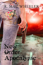
not sure what you mean with "gritty". As I have not read the books it is hard to have an opinion. But, as a photographer and artist I think some of the images is "hard to read" they makes no sence. And I think a cover should say something about the story.
I agree that a lack of knowledge about the story makes a comment tenuous, but I'd probably go for bottom #3. Possibly bottom #5 for it's readability. The ones on this page immediately to the right-- Just Dead and Dead Maybe are effective. I like the reflection in Dead Maybe.
Wow, it is kinda hard to say. I do think the top row is much busier but then again maybe it should be. The bottom row is easier to read all the small print----- MB


I'm no expert on these things but you asked for opinions...
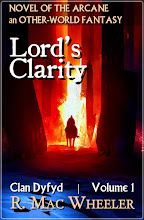
ReplyDeleteMy choice would be the bottom line five.
I wonder what others will think?
All the best Jan
I am with Jan. The tops ones are a touch too 'busy' for me.
ReplyDeletenot sure what you mean with "gritty". As I have not read the books it is hard to have an opinion. But, as a photographer and artist I think some of the images is "hard to read" they makes no sence. And I think a cover should say something about the story.
ReplyDelete...take a dart and throw it.
ReplyDeleteI agree that a lack of knowledge about the story makes a comment tenuous, but I'd probably go for bottom #3. Possibly bottom #5 for it's readability. The ones on this page immediately to the right-- Just Dead and Dead Maybe are effective. I like the reflection in Dead Maybe.
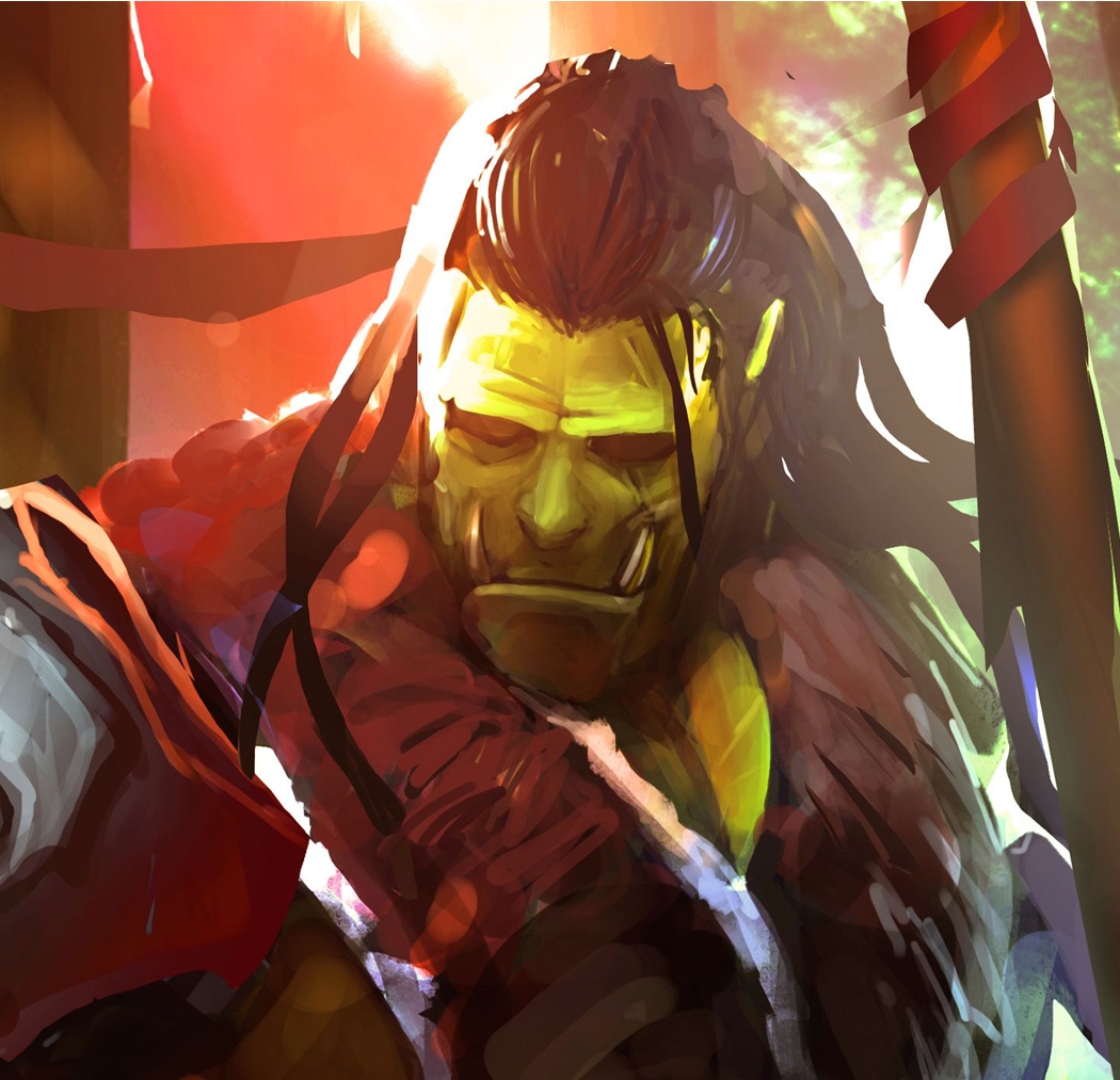
ReplyDeleteTop Middle! I like the tough dark look and it says bounty hunter to me.
ReplyDeleteLisa
If the new look is the top row, I like them very much.
ReplyDeleteWow, it is kinda hard to say. I do think the top row is much busier but then again maybe it should be. The bottom row is easier to read all the small print-----
ReplyDeleteMB
8 and 9...less complicated and easier to read without getting distracted!!!
ReplyDelete