There should
have been an echo in the long corridor. Maybe it was the settled dust that
muffled it. The slices of light slashing the black from the intersecting
offices sparked a memory, one that usually hit me neutrally. That moment it
simply represented the end.
I was in my
early teens. Dad had taken me with him to Miami one evening, Center business.
This is when the region still held onto a smidgeon of civilization, and lucky neighborhoods
still had power. I watched in awe at the alternating street lights looming over
I-95, about ever fourth light live, challenging the gloom, staccato flashes
illuminating the inside of the car. Tampa streets had been dark as long as I
could remember.
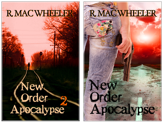
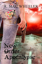
Which of these NOA2 covers do you find more eye-catching/complementary to NOA1?
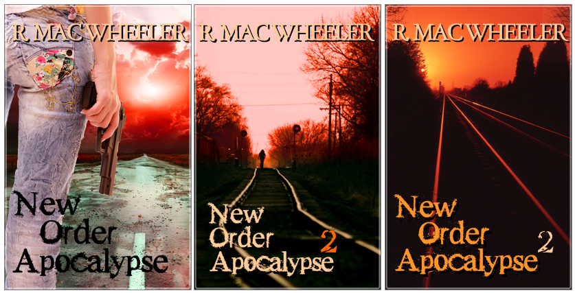
Which of these NOA2 covers do you find more eye-catching/complementary to NOA1?
Update: Leaning toward this now:
-R.
Mac Wheeler
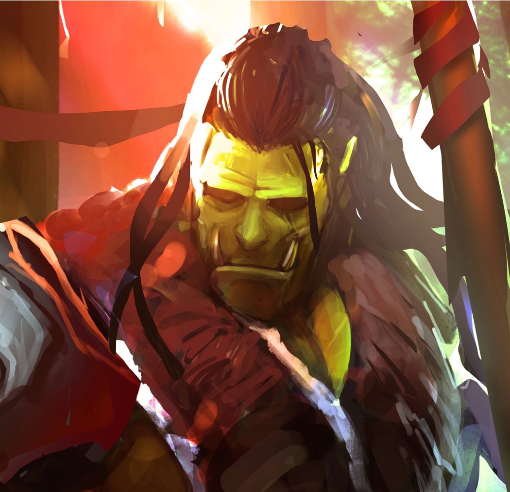
The first NOA2 image from David Joseph Gall, www.DavidJosephGall.com
The second NOA2 image from AJ Yakstrangler , www.flickr.com/photos/yakstrangler


Nice, but, I don't read.
ReplyDeleteRead my 'about me'.
ReplyDeleteI like the first NOA2 cover best, except your name doesn't really POP. Unfortunately, I don't know how to fix that! It's why I don't design covers. :)
ReplyDeleteHow come you're using numbers instead of new titles? Is that because of the movie industry or do you just struggle (like most of us) for book titles?
I like the middle NOA best.
ReplyDeleteI also wanted to comment on your Writer Unboxed post. I read the article and appreciated Mr Maas' direct approach to debunking some myths. I think too often new authors self publish out of impatience. I enjoyed the article; thanks for bringing it to my attention.
have a good weekend Mac.
.......dhole
It gets my attention!
ReplyDelete